From Incident Counting to SLIs: How DigitalOcean Rethought Availability
- Published:
- 5 min read
Our journey to truly understand our customer experience began with a hard look at our internal availability numbers at the start of 2025. We saw something uncomfortable: the numbers didn’t match our customers’ reality. Our monthly availability oscillated between 99.5% and 99.9%. Those peaks and valleys depended more on whether we declared a high-severity incident that month than on how the platform was actually performing. Customers were still experiencing issues and opening escalations, but the metric didn’t reflect customer availability.
The previous internal measurement served us well in our early days, but its limitations became evident as DigitalOcean expanded. Our incident-based approach treated any declared incident as a total outage and anything below the severity threshold as invisible. This created a structural trap: we couldn’t expand coverage to include lower-severity issues without artificially destroying our availability number, because the formula would count every minute of a partial degradation as a full platform outage.
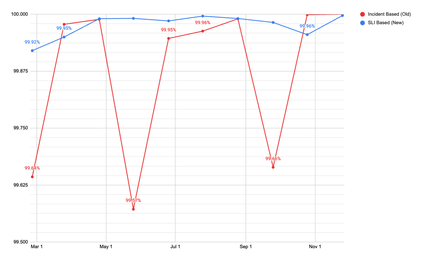
The chart above shows monthly platform availability using both methodologies over the same time period. The incident-based (old) swings between roughly 99.5% and 99.9% month to month. The SLI-based metric (new) holds consistently at 99.95% or above. The old metric was measuring noise, while the new metric measures actual availability signals.
This isn’t a problem unique to DigitalOcean. Any platform that measures availability by counting incident minutes against total calendar time will eventually hit the same wall. The incident-based metric was both too generous and too punitive, depending on where the line was drawn.
Thisarticle walks through the operational framework we built to replace that system, the architectural decision to split the measurement into Control Plane and Data Plane, the two different SLI methodologies we use for each plane, the Prometheus recording rules and multi window alerting that make it operational, error budget policies that now drive engineering priorities, and how this framework is extending to newer product lines including our GPU Droplets and Agentic Inference Cloud products.
The Old Methodology
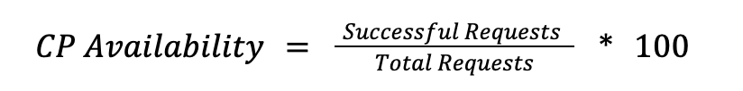
The original formula was simple and was measured weekly based on incident duration:

If no incident was declared in a week, then availability was 100%. If an incident lasted two hours, we subtracted those 120 minutes from the total and got our number. This methodology served us well initially, but it had three main problems as our platform and product offering grew:
- During an incident, it assumed 100% of the product was down for 100% of customers. Outside of an incident, it assumed everything was fine. There was no way to represent partial impact.
- The global availability number was the mean across around 30 products. There was no volume weight. A product with a few hundred daily requests pulled to the average as much as our Droplets or Spaces products.
- The same availability formula was used for every DigitalOcean product offering, even if it was not the best representation of their uptime.
Splitting Our Measurement: Control Plane vs Data Plane
The first decision was to stop treating all availability the same. A slow API response when creating a Droplet is a different kind of failure than a Droplet being inaccessible. One is an inconvenience, the other is active customer pain. Lumping them into a single number was hiding signal in noise.
We split measurements into two planes, each with their own SLI methodology.
Control Plane
The control plane covers the orchestration layer, including API calls like create_droplet or update_firewall and Cloud Panel operations. The SLI is the success rate for valid requests:
We count only server errors (5xx) as failures. Client errors (4XX) stay in the denominator but are excluded from the failure count, since a malformed request from a user isn’t a platform reliability signal. If the Control Plane degrades, users see errors in the API or Cloud Control Panel for CRUD-type operations, but their running workloads (Agents, Serverless, GPU Droplets, Databases) are uninterrupted.
Data Plane
The data plane covers the live product instances: running CPU and GPU Droplets, DOKS Clusters, Spaces Buckets, Serverless Inference endpoints, AI agents. Measuring Data Plane is more nuanced than Control Plane because different products fail in fundamentally different ways. There is no single formula that fits all of them.
For products where availability means “the resource exists and is healthy,” regardless of the active usage, we use resource minutes.

A resource minute represents one resource being available for 1 minute.
For products where the Data Plane serves requests directly, we use the same request-based approach as in Control Plane, but measured at the serving layer:

Below are some examples on how this looks on practice:
- Droplet Networking (resource-minutes): A Droplets network is considered available when all connectivity probes pass simultaneously. The data path reachability, public routing (ipv4 and ipv6), management interfaces, among others. It’s a logical AND, which means all probes must pass. If any single probe fails, that minute counts as a failed resource-minute for that droplet.
- DOKS (resource-minutes): A cluster is available when 3 conditions are true simultaneously. The Kubernetes API is reachable, etcd has an elected leader and the API server is serving healthy responses (non-5XX). If any of them fails outside of a planned maintenance window, the cluster scores 0 for that minute. Maintenance windows are excluded, so planned operations don’t count against availability.
- Spaces (request-based): Availability is measured as the ratio of non-5xx responses to total requests at the storage load balancer layer. Rate-limiting responses (503s) are excluded from the failure count, since they represent intentional throttling and not a platform failure.
The definition of a failed state varies by product because a Droplet with broken networking, a DOKS Cluster with no etcd leader, and a Spaces object that can’t be retrieved are all “unavailable,” but they fail in completely different ways. Each product defines failure in terms of what the customer actually experiences.
Here’s how the two planes fit together:
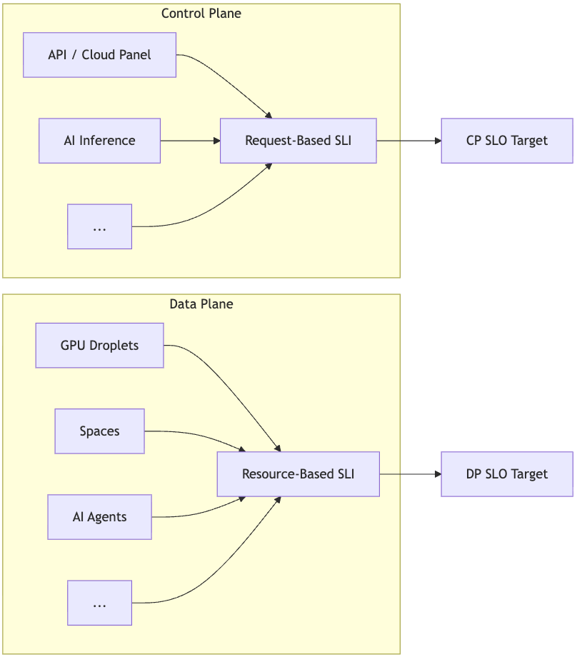
The separation of control and data plane gave us two things we didn’t have before. First, we could set different SLO targets per plane, because the tolerance for a failed API call and inaccessible storage is not the same. Second, we could make meaningful comparisons with how other cloud providers structure their SLOs, which follow this same control plane/data plane distinction.
Magnitude matters
With the Control Plane and Data Plane defined, the next problem we faced was aggregation. We operate across multiple regions with different traffic volumes. A failure in a small data center (DC) and a failure in our busiest DC are not the same, and our metrics needed to reflect that.
Control Plane
We used a weighted request average by volume. This means that we sum all raw success and total counts across all DCs before calculating the ratio. A DC handling only 20% of traffic contributes only 20% of the signal, meaning no manual weighting is needed.
Example using NYC3 and TOR1:
About the author
Related Articles

The LLM Inference Trilemma: Throughput, Latency, Cost
- April 22, 2026
- 12 min read

Mastering the 600B+ Frontier: Optimizing Large Model Deployments on the Inference Cloud
- April 21, 2026
- 9 min read

The Inference Cloud Memory Layer: A Technical Dive into DigitalOcean Managed Databases
- April 17, 2026
- 10 min read